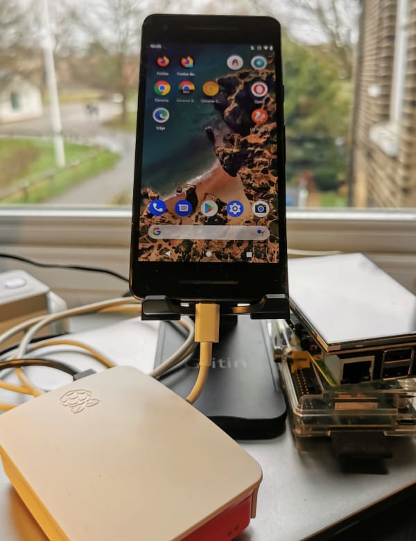
Setting up an Android phone as a WebPageTest agent

Pixel 2 connected to a raspberry pi

Running detailed website performance tests is often necessary to understand how a website is experienced by an end user in order to identify opportunities for improvements.

WebPageTest.org gives us the ability to run these tests from all over the world – the public instance even gives us access to real devices, so we can check how a site works across different browsers on different versions of different operating systems on different real devices!

In my previous articles I explained how to easily set up your very own private, autoscaling, WebPageTest server. This private instance creates test agents in AWS, dotted around AWS regions, which can emulate a mobile browser; this uses the device emulation in Chrome to throttle network, CPU, memory, etc and change the available screen size.

While this mobile emulation is simple to set up and use, sometimes an emulator isn’t enough; device-specific edge cases, operating system limitations, and performance on a real device may need to be validated to get confidence that everything works as expected in the real world.

In this article I’ll show you how to set up an Android phone as your own WebPageTest agent to connect to your private WebPageTest server, controlled by a Raspberry Pi!

Continue reading

Android browsers, keyboards, and media queries

If you have a site that is intended to be mobile friendly, is reasonably responsive (in a media-query-stylee) and has user input areas, you may find this issue on Android due to how the keyboard interacts with the screen:

Nice text input area

portrait_text_entry

Oh noes! Screen gone wrong!

confused_orientation_text_entry

It turns out that on Android devices the keyboard doesn’t overlay the screen, but actually resizes the screen; this can cause your media queries to kick in, especially if you use “orientation”:

[css]
(orientation : landscape)
[/css]

[css]
(orientation : portrait)
[/css]

To fix this, try changing your orientation checks to aspect ratio checks instead:

swap
[css](orientation : landscape)[/css]
for
[css] (min-aspect-ratio: 13/9) [/css]

and
[css](orientation : portrait)[/css]
for
[css](max-aspect-ratio: 13/9)[/css]

Ahhh – success!

corrected_text_entry

Reference http://abouthalf.com/development/orientation-media-query-challenges-in-android-browsers/

Android jellybean premium update 2012 Dec 29

My Samsung S3’s Android OS has just updated this morning, so I thought I’d share some of the funky stuff found so far.

Firstly there’s an updated swipe keyboard which shows a single potential word whilst you’re swiping instead of waiting until after you’ve finished.

It also seems more accurate in both the word matching and the prediction (e.g I only had swiped the pre of prediction before it appeared as the single possible option). However it doesn’t automatically show punctuation after you’ve finished a word, so adding a comma or exclamation mark takes a couple more taps now.

The camera has been changed so that you can get burst mode simply by holding the shoot button down.

There’s an updated allshare interface for streaming media, but even though I have other Samsung devices on my network it’s not picking them up. Maybe more configuring is needed.

image

New options in jellybean update

The coolest thing I’ve noticed so far is the multiwindow option which allows you to split the screen and have more than one thing running on screen at once.

image

Multiwindow jellybean update intro

Multiwindow jellybean update

multiwindow jellybean update with chrome at the top and facebook underneath

Kinda funky. What else is there?